
|
Getting your Trinity Audio player ready...
|
The Verge has a new website design that rethinks the experience of news readers. What does this move say about the state of news media?
The Verge’s radical website redesign was announced three months ago, and one of America’s biggest tech news publishers is still the talk of the town. While most news websites tend to highlight a few stories at once – a big headline at the top, catchy titles crammed up on the homepage, self-playing videos and ads – The Verge team decided that something needed to change.
The goal was to offer something that looked like no other website and where form and function were equally important. Indeed, the change is so radical that it seems to symbolise more of a business model shift than a purely aesthetic action.
One of the rationales behind the redesign is getting readers to come to The Verge’s website homepage more frequently by including a Twitter-like content feed of content manually updated by editors and senior reporters.
That’s unusual – very few people today get their news directly from the homepages of news websites. Not many readers would type, say, nytimes.com in their browsers; they instead land on news sites via social media, search engines, news aggregators, mobile apps and newsletters. But The Verge has a big direct audience on their homepage – and with the redesign they are betting it could be bigger still, trying to reduce reliance on external platforms that has bedevilled many digital publishers over the past decade.
A drastic change against algorithmic news feeds
It seems that the idea behind the new The Verge is that the news website’s biggest competitors aren’t other publications that cover technology such as Wired or The New York Times. “Our competition is Twitter and other aggregators of audience”, said editor-in-chief Nilay Patel to Axios, highlighting that users don’t purposely visit homepages frequently anymore.
In a post on the new design, Patel wrote: “Our goal in redesigning The Verge was actually to redesign the relationship we have with you, our beloved audience. Six years ago, we developed a design system that was meant to confidently travel across platforms as the media unbundled itself into article pages individually distributed by social media and search algorithms. […] But publishing across other people’s platforms can only take you so far. And the more we lived with that decision, the more we felt strongly that our own platform should be an antidote to algorithmic news feeds”.
While news media largely tends to be dependent on Google and social media algorithms for users, The Verge is trying to reverse the trend and forge a direct relationship with readers with an approach that goes beyond tools like podcasts and newsletters. This also means creating a trustworthy, niche space for news that is not available on social platforms.
The Verge’s new website look
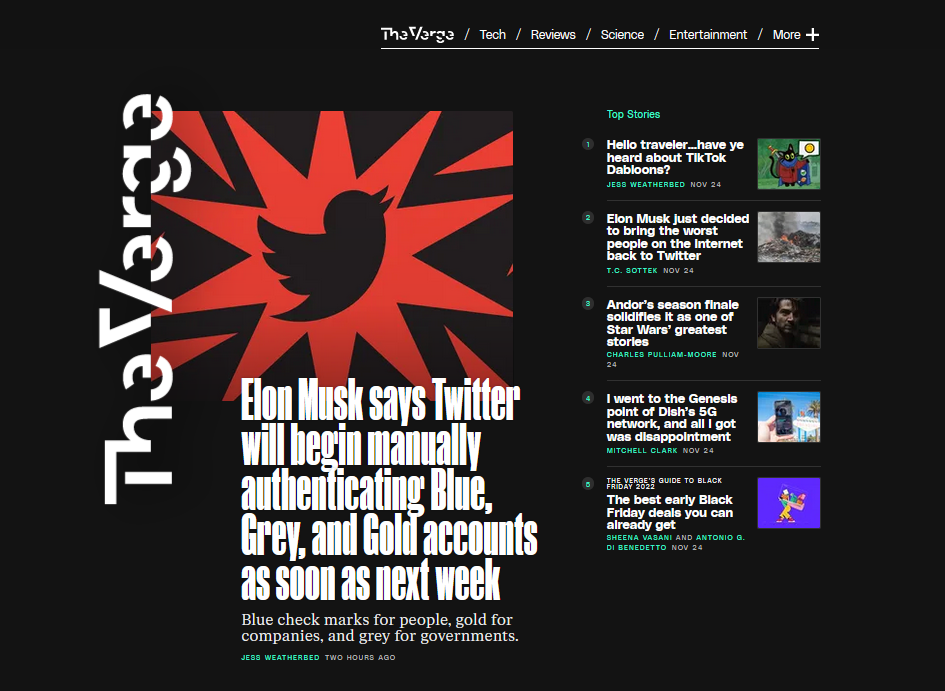

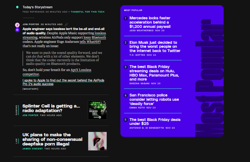
The unconventional homepage redesign features two vertical feed modules–the main article on the left and the top stories on the right. As you scroll, there comes the “Storystream” newsfeed, which updates automatically and can embed both social media posts and smaller bits of content (called “Quick posts”), and a “Most popular” feed of recent articles.
“We definitely think there’s a future for a homepage”, says Ryan Gantz, design architect at The Verge’s parent company Vox Media, who has worked on the new website look. “Most of The Verge homepage traffic is from loyal and engaged readers who visit every day, often multiple times. And we just deployed a new layout for the top of the homepage, which clarifies the hierarchy a bit, helping the audience distinguish between top stories and the more bloggy format”.
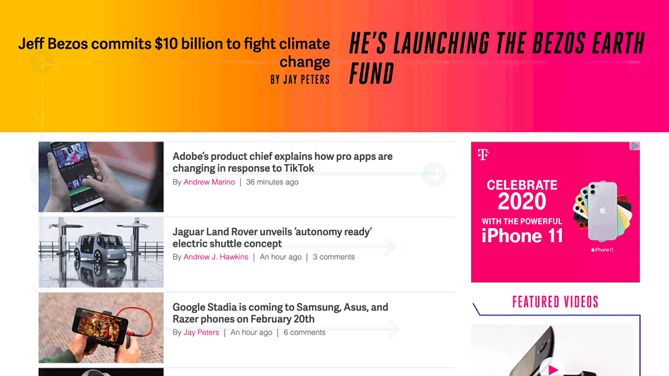
Scrolling further, more small bits of content appear on the left, while the right side (in bright colours) offers a theme-based feed: tech, podcasts and reviews. The effect is dynamic, but also tends to be overwhelming with information, exactly like a mix of blogging platforms and social media websites.
Usually, news sites are designed in a way that readers tend to scan the pages in an F-pattern – from the top left to the top right, then down to the next line from left to right. The Verge redesign has changed that visual hierarchy; now, there are multiple modules to be looked at once. Gantz says that “those are iterations that help audiences understand what things mean on the page, regardless of what sort of user agent their own. And other improvements we know people have requested (like a switcher to view the homepage in light rather than dark mode) were already planned as part of a longer roadmap. The Verge launch represented the first site Vox Media’s new front-end platform called Duet, so the lessons from this work and improvements we’re making there will be baked into future sites.”
Overall, the goal of the changes is to make readers visit the homepage more often. As The Verge’s publisher Helen Havlak told Axios, “If I can just get people to the last point to refresh our site one more time a day, that is a huge lift to my business.”
Another rationale for the redesign is to save time for the newsroom. Earlier, even the smallest bits of news updates required a full editorial workflow. Now, social media posts can be directly embedded in the feed on the homepage. Patel had added in his post: “we won’t have to stop everything we’re doing and debate writing an entire story about one dude’s confused content moderation tweets. We can just post the tweets if they’re important, add the relevant context, and move on.”

Drawbacks of the new approach
The idea of the story stream seems great on paper, but the readers’ response has been mixed. There have been complaints, particularly about the accessibility issues of the design. It is hard to scan and scroll through the hierarchy of articles to find what one wants to read. Additionally, jumping between different typefaces in the articles can feel unsettling, especially when news sites make an effort to respect user preferences for colour settings.
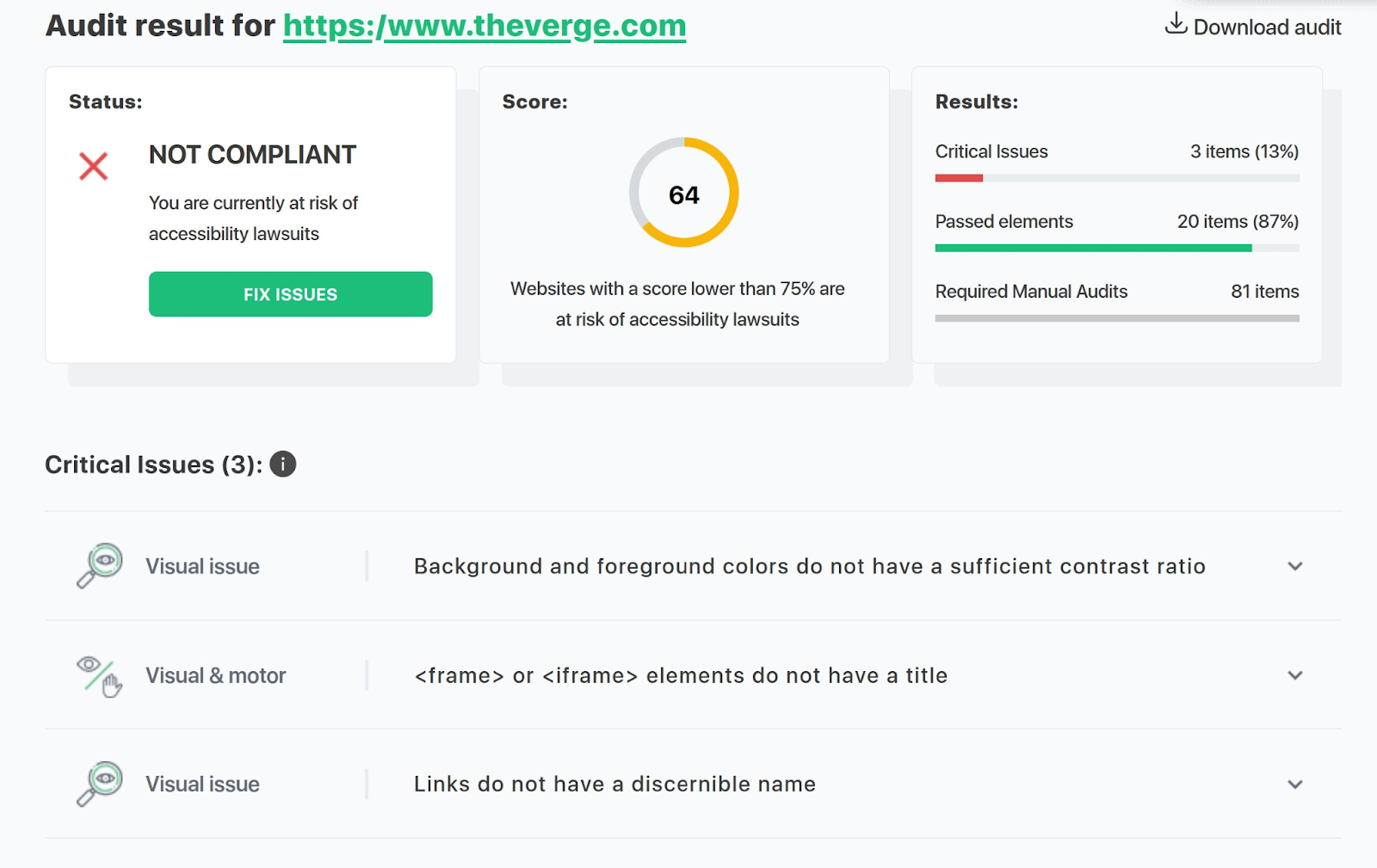
Audit results of The Verge redesign from the website accessibilitychecker.org, a compliance checker that helps authors make their web content more accessible to individuals with disabilities, are also underwhelming. The results say that the contrast ratio of the colours is not high enough on the website, there are “no title of frame or iframe elements, links do not have a discernible name.”
Patel, in his post on the website, said that “sometimes you just have to blow things up and start over”. The message seems to be that design doesn’t adapt to users, it is the users who have to adapt to the design. The question then is what is it that readers really want in a news website? Should they lead the decision process or should they be handed a finished product and given time to adjust?
Adjusting to reader needs, just a little
Of all the complaints and the general confusion over the redesign, a comment that resonated a lot among the readers was that if they wanted to read Twitter posts, they would go to Twitter. Patel’s response to that criticism was that The Verge team “made everyone talk about an open web redesign in 2022”. True, see what we’re doing here, still talking about it. Perhaps more importantly for The Verge’s business, the direct-to-homepage audience was up by about 20 percent, which according to Patel meant that the redesign was working for The Verge’s loyal readers.
Since its launch, The Verge has updated its redesign a little. Gantz says that the team “has been pushing all sorts of minor fixes and improvements since launch, including quite a bit around accessibility. Our company/product team standard for our sites is to meet Web Content Accessibility Guidelines (WCAG AA) compliance standards, so there have been a long tail of improvements pushed on that front. Some of these are small but measurable: adjusting colour values and usage to meet 4:1 contrast standards, link underlines, form adjustments. Others are less measurable but arguably more important: adjusting the letter-spacing of Manuka [font] for readability, making sure that decorative text elements have a more readable equivalent”.
The upshot for news media
What The Verge episode tells us is that design is still an important aspect for news sites in the direction of community building. Forum-like platforms still thrive, particularly with niche subjects (think: Reddit). The Verge redesign is a good example of how publishers need to start thinking about new ways to bring the conversation onto their sites. There is a need to reimagine a closer relationship with the audiences even if it means redirecting them to other relevant forums and posts. If we ignore the flashy colours and custom-made typefaces of The Verge, we can definitely see that users want two things: news and a community around it. The broad lesson here is that beyond tools like podcasts and newsletters, the homepage of a website may represent that safe and trustworthy space to directly engage with the readers.
The publishers need a loyal and engaged audience, as much as they need a smooth editorial workflow. This means that some types of content may require less manual work than others and be less time-consuming. In that, the idea of “quick posts” can be useful to understand what needs to be given priority with editorial resources.
While it is virtually impossible to imagine a full, centralised conversation about news on a news website homepage, there are still takeaways for online publishers in this redesign. No matter the arrangement, the idea to create a place for a community much smaller than social media’s hundreds of millions of active users can be worth replicating.
This piece was originally published in The Fix and is re-published with permission.

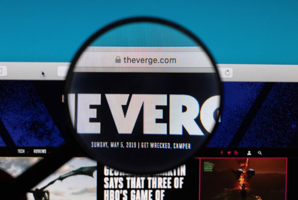
Source of the cover photo: Flickr