

|
Getting your Trinity Audio player ready...
|
A look at the top reader revenue-driven news organisations’ subscription conversion pages. How NY Times, WSJ, Bild and Le Monde’s subscription offer pages evolved over the decade.
Leading technology companies like Amazon, Google, Microsoft, Facebook and others conduct more than 10,000 controlled experiments yearly to enhance user experience or, more importantly, to increase revenue.
In 2012, one of Microsoft’s engineers working on Bing suggested an experiment that was shelved even though it would be easy to implement.
Six months later, when another employee looked at it and figured it was fairly easy to set up, within a few days the experiment was started and the increased performance resulted in more than $100 million additional annual revenue bump in the United States.
Experiments and A/B tests are a must in the digital world. The leading digital news businesses know this and also run many experiments; some of them occasionally share the results.
Over the years, there have been many things I kept an eye on, but most recently it has been the subscription offer (product) page. Comparing different publishers’ approaches is tricky.
For some, the conversions straight from the articles are more important, and they don’t make a lot of changes to the subscription page. I would assume that the less that page has evolved in recent years, the higher the chance it is less important than other conversion elements.
It goes without saying that great content remains the biggest driver of subscription, as the NYT Company CEO Meredith Kopit Levien reminded us repeatedly in a recent interview: “lead in news and be the world’s best news destination.”
Still, looking at the top players in the news digital subscription landscape and the evolution of their offer pages might also give you some ideas of what to try or test next time.
Key findings: Less wordy, bigger buttons, one main offer
In this analysis, I looked at three groups of news publishers – US-based, UK-based and three from continental Europe (Germany, France and Italy). For each group, I chose the top outlets with the most digital subscribers or paying supporters based on the latest Global Digital Subscription Snapshot by FIPP.
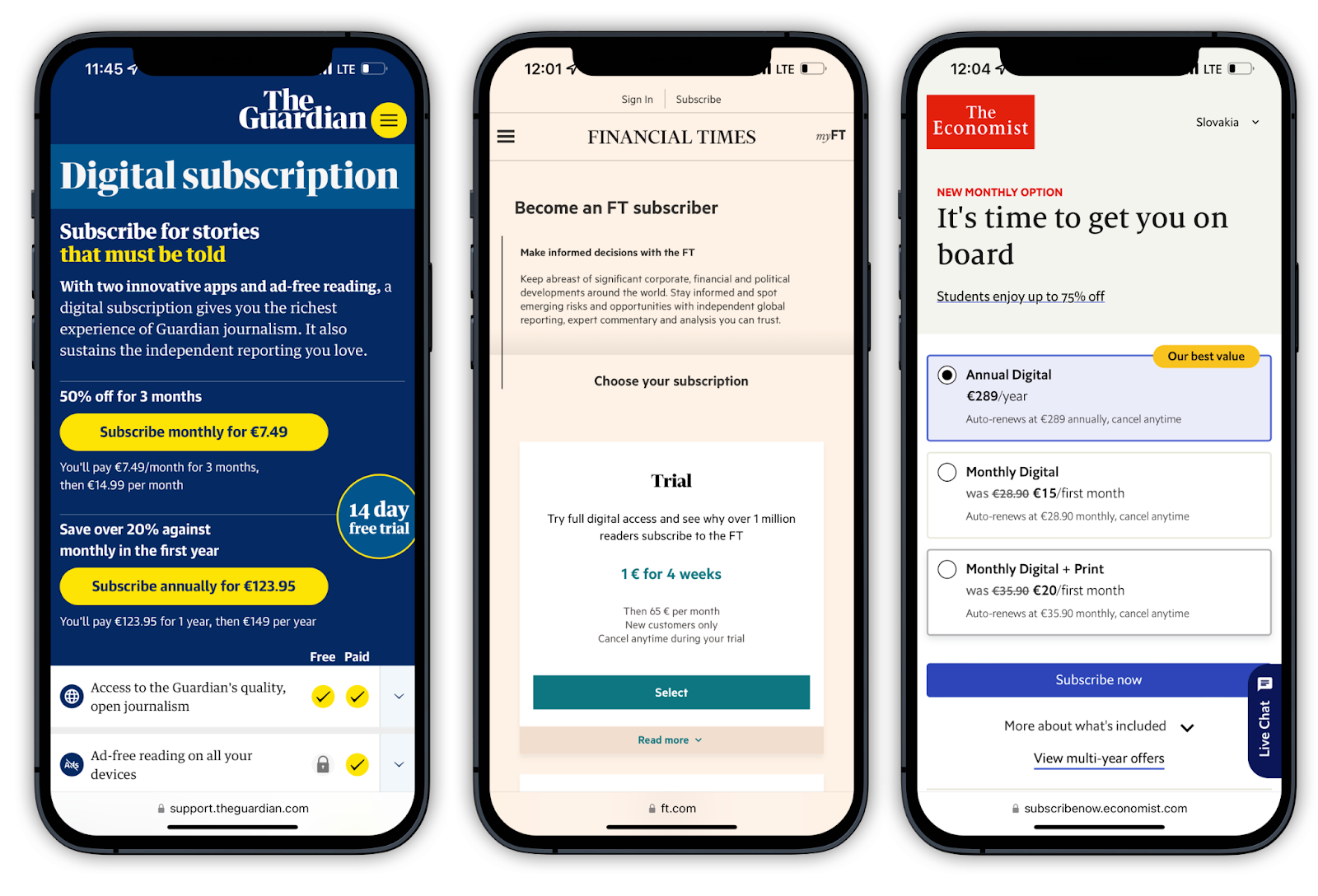
Take The Guardian – its offer page for contributions and digital subscriptions hasn’t changed that much over the years. Why? Open any article and at the end, you will find the basic offer which leads to the checkout page. I suppose most of the million paying supporters came through that.
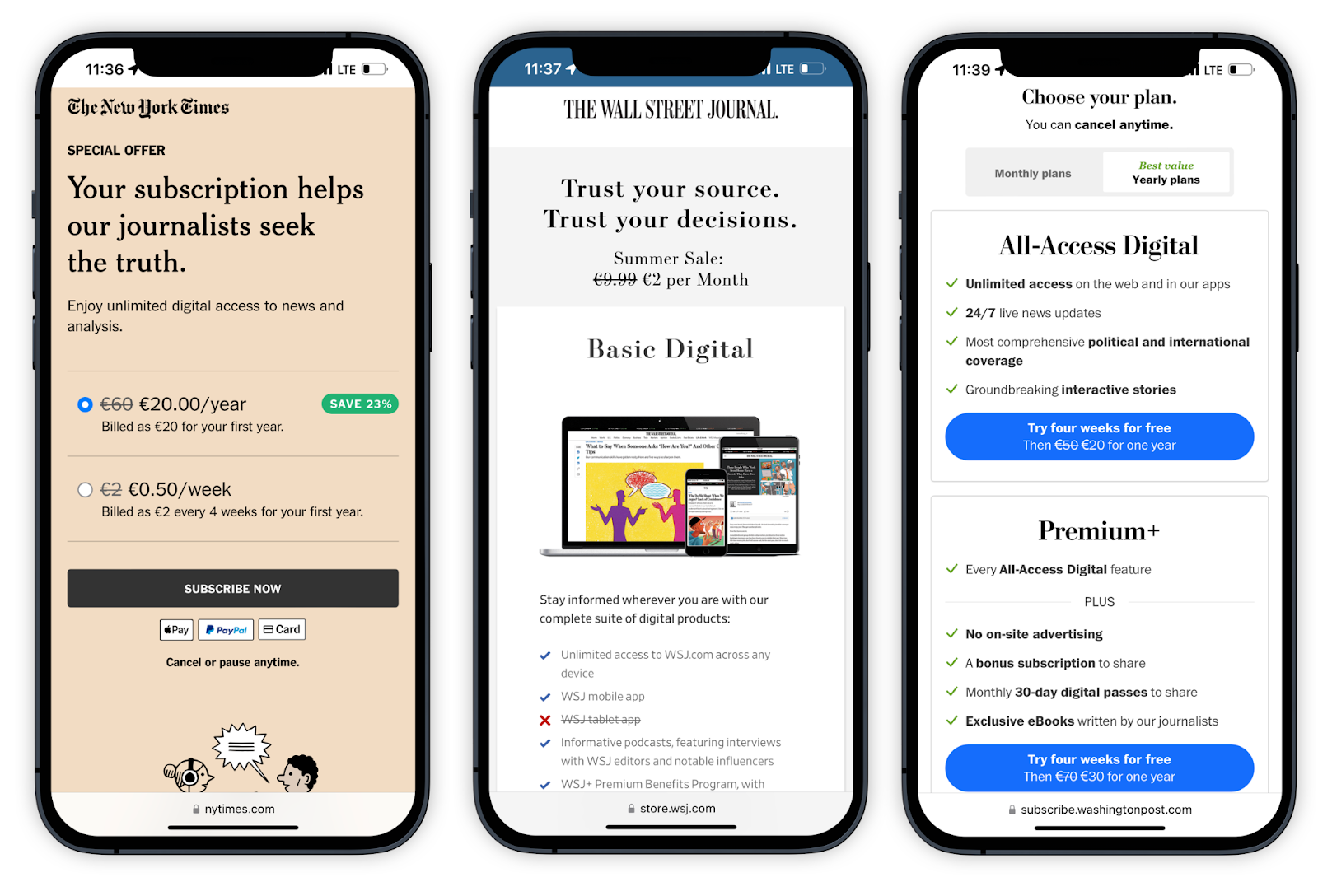
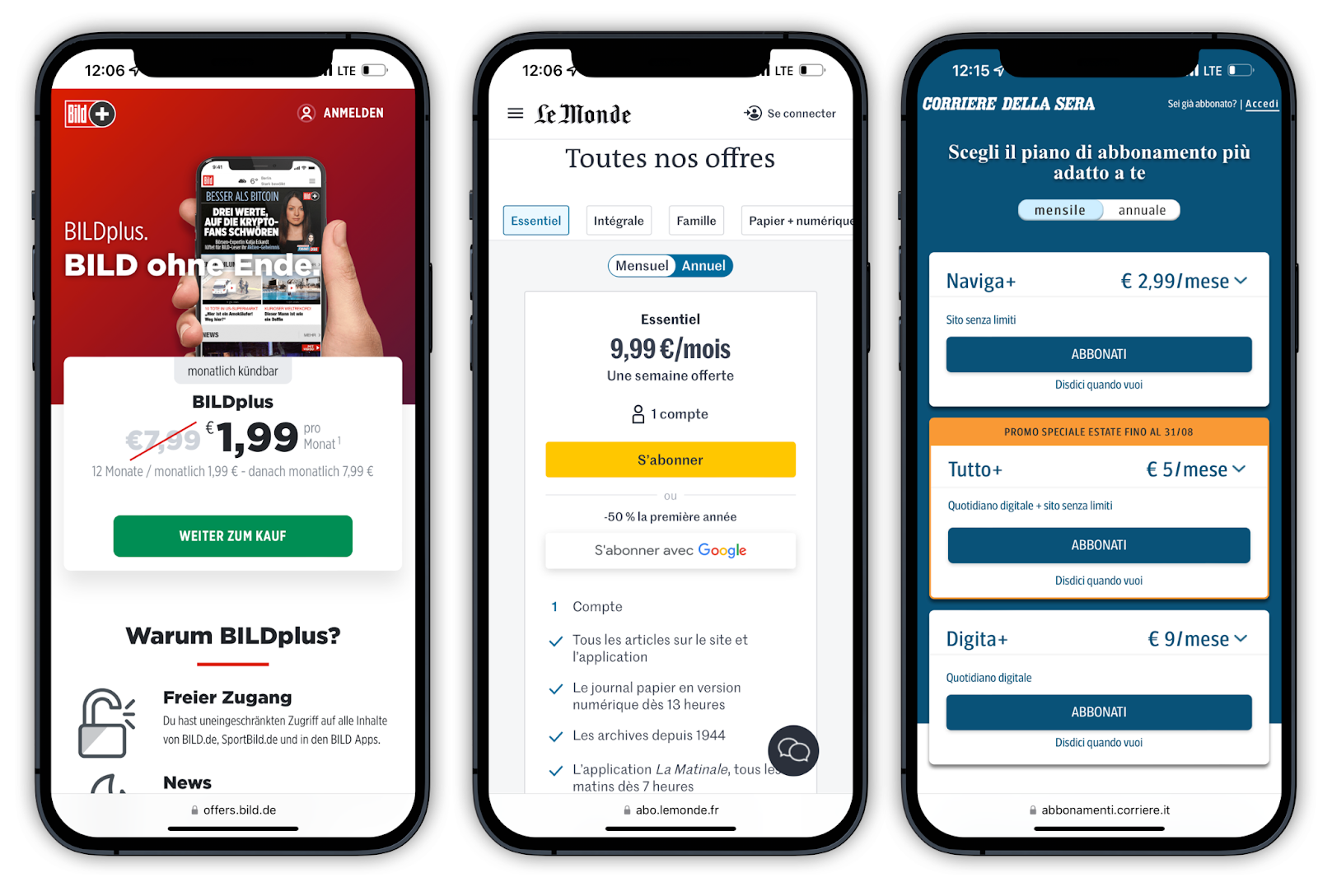
On the other hand, The New York Times or The Wall Street Journal are very different stories. Their subscription offer pages have changed almost every year quite significantly over the past five to seven years. The same goes for Bild.
All three ended up having a single button for their basic subscription offer on the page leaving the visitors no options to choose from or get stuck thinking about. The choice became binary – do you want a subscription or not? The upsell comes later. The hardest is to get someone on board; once there, you can start with offering extra features.
Another interesting observation when looking at the changes across these three markets and nine leading outlets is that with every change they cut words (Le Monde being an exception as it added more text) and kept making the “subscribe” button bigger.
Before diving into this analysis, I thought I would find more similarities than I did. It seems like every publisher is charting its own path to success. Let’s not forget that these are all prime examples of successful organisations with thriving digital subscription businesses.
In terms of inspiration, it’s interesting to look at what all of them chose to emphasise. There is the classic introductory offer (or trial). In a recent research of 100 most popular subscription sites among US audiences, Toolkits found that 75% offered discounted trials (93% were paid, not free) and the average length for the primary trial was 7 months (28 weeks).
Other publishers in this analysis chose to show the whole range of their subscription tiers (the Italian Corriere Della Sera or The Economist).
One of the inconsistencies I found puzzling was that there was no clear product winner in terms of monthly or yearly default. NY Times, The Washington Post and The Economist have the yearly, heavily discounted subscription as their default product.
Financial Times offers a 4-week recurring subscription and the rest monthly. Also surprising was the lack of Apple Pay / Google Pay payment option straight on the offer page (only NY Times and Le Monde).
Overall I think there is no one way of building a successful subscription page. What is clear is that cleaner and simpler design has been one of the driving changes. Less clutter, less words and icons and high contrast conversion buttons seem to be doing the trick for the leading digital news subscription-based outlets.
And keep in mind, having a well-tested and optimised subscription offer page is only part of the success (but an important one).
The New York Times (8.3 mil. subscribers)


Wall Street Journal (3 M)

Screenshot of the WSJ subscription page 2015

The Washington Post (2.7 M)


The Guardian (1 M)


Financial Times (1 M)


The Economist (568k)


Bild (600k)


Le Monde (420k)


Corriere della Sera (384k)


Check out more of the subscription pages below.
This piece was originally published in The Fix and is re-published with permission.