

|
Getting your Trinity Audio player ready...
|
Building data news dashboards got much easier in 2021 and there are new issues that need to be addressed.
In 2016, the Reuters Institute for the Study of Journalism concluded that with different news media having different editorial priorities and organisational goals, there is no one right way to do editorial analytics.
That conclusion still holds in 2021. And that’s why I was struck, when researching this topic, that we as an industry (media & journalism) had stopped talking about data, analytics and dashboards.
Five years ago, Chartbeat was at the peak of its popularity, media-focused sites were frequently writing stories about data in the newsroom and emerging news startups were vocal about their data-driven approach to getting engagement. Looking back, it was a very different world.
Still, though the coverage has fizzled, data and editorial analytics have remained an important part of many newsrooms. Just think back to the last journalism conference you attended (The Fix’s Media Revolutions conference, for example). Almost always, when you hear a case study or success story, there is a point when the researcher says that they built a dashboard to track changes and progress, and monitor the overall situation.
It’s a phrase I’ve heard countless times: “And we built a dashboard.” I never thought to ask the people saying it to expand on what they did. I should have asked each and every time to explain how those creating and using these dashboards thought about the structure of their data and about how they got there.
Recently, we have been developing digital dashboards in my newsroom, and even though I had many notes from the conferences and knew what data I wanted to monitor, it was still hard to convey my thoughts in clear terms to the data analytics team.
Building digital news dashboards
It is easier to create a new dashboard now than it was five years ago. Partly, this is because of Google’s decision in early 2017 to make Data Studio free for everyone.
The dashboarding and reporting tool is easy to use, and if you are not afraid of Excel and spreadsheets, you can easily visualize data from your reports. While not everyone is using Data Studio, it has become a go-to tool for many data analysts, and has simplified a task that used to require a long process of backend development.
When in early 2016, for example, The Guardian’s Quality Assurance team wanted to build a dashboard for one of its projects, they had to set up a new web page and use a third party charting tool (Highcharts) to visualize the data.
Now, if you have a data source, the process requires just a few clicks in Data Studio.
There are drawbacks. Some argue that such easy-to-use tools send the wrong message, implying that you do not need an expert. Teams may end up building dashboards that put their work in the best light rather than creating an effective tool for understanding what’s happening.
Another issue with easy to set up dashboards is that you can get lost in them. Sure, managers like to hear, “and we set up a dashboard where we monitor the project,” but at some point you are going to get in trouble, if the tool is impossible to navigate.
Data democratization, dashboard marketplaces and building a data-informed newsroom
When I talked to data analysts about this, they recommended a few steps to avoid serious problems. Every time you create a new dashboard make sure there is someone in charge of it. Show the time and date the data in the dashboard was last updated. Have a single place where all your organization’s dashboards are updated.
That last point is also crucial when making sure everyone has access to data in your newsroom. Also, when talking about data democratization it is vital that the end users (editors, journalists) understand the way data is presented.
I can speak from personal experience that the rule less is more also applies here. The newsroom staff has to regularly make quick decisions, so giving them a super comprehensive reporting tool that’s difficult to navigate will slow them down and they will not use it. A simpler tool, with just the right data points, makes a huge difference, meaning they will use it more and also understand it.
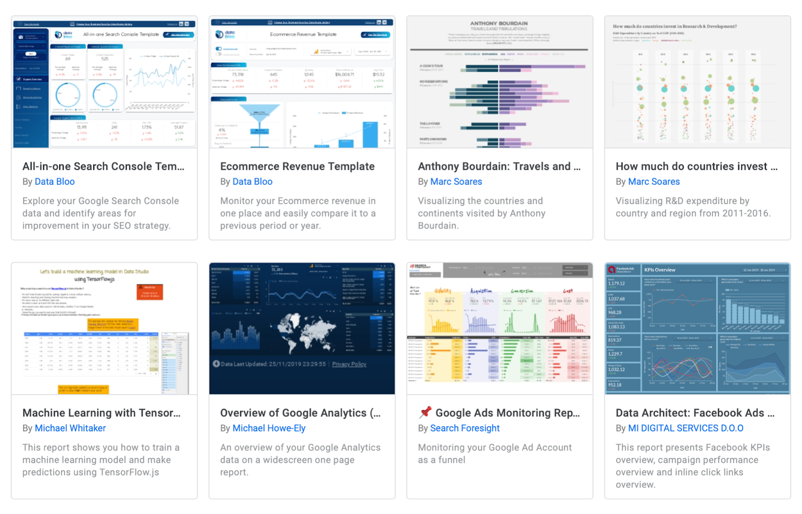
Before you set out to create a brand-new dashboard, do some searching to see if someone hasn’t already built it. Google’s Data Studio keeps a report gallery where you can browse ready to use dashboards, and if you start looking, the internet will spit out more resources.
There are even people on freelancer sites like Fiverr, who will do the work of creating an excellent Data Studio report for you.
A few years back, there was a debate about whether data-driven is the best way to describe the use of data in journalism. People smarter than me argued that maybe data-informed and data-inspired are better terms.
Building a data-informed newsroom does not have to mean setting up a big monitor in the middle of the open space with a fancy moving dashboard. (Though there are places still doing that and that’s fine too)
Sometimes it is the simple solutions — like a daily e-mail to everyone with the best performing articles for the previous day (a practice used by the Slovak Denník N) — that work better. Or, if you want to go for “simple +”, you can create a more personalized ‘report by e-mail’ for different groups in the newsroom.
This piece was originally published in The Fix and is re-published with permission. The Fix is a solutions-oriented publication focusing on the European media scene. Subscribe to its weekly newsletter here.