
|
Getting your Trinity Audio player ready...
|
From public data feeds to web scraping there is more information available to reporters than ever before and making sense of that information can be a challenge. Done well, data visualisation helps publishers present highly complex information and communicate the relationships between different data points to aid audience understanding.
Why it matters
- Combining the scale and range of digital information available today with traditional reporting techniques creates powerful storytelling opportunities. From recent Coronavirus coverage in The Financial Times’ Coronavirus Tracker back to Bloomberg’s 2015 The Deadliest Jobs in America, publishers have been enriching their content with visualisations that bring readers a better understanding of highly complex issues.
- There is so much information available to audiences today that presentation has become as important as reporting for the publishers. Trend stories in particular rely on clear analysis of the numbers over time and data visualisation can help journalists tell complex, evolving stories through easily accessible, often interactive, infographics.
- When done effectively, data visualisation can be a huge draw, the FT’s Coronavirus Tracker being a good example. “The page the trajectory charts all sit in is now by a large margin the FT’s most viewed page ever,” The FT’s Senior Data-Visualisation Journalist John Burn-Murdoch told the Media Voices Podcast. “But incidentally, the second most viewed ever was our Brexit poll tracker page that we did back in June 2016.”
How to use data visualisations
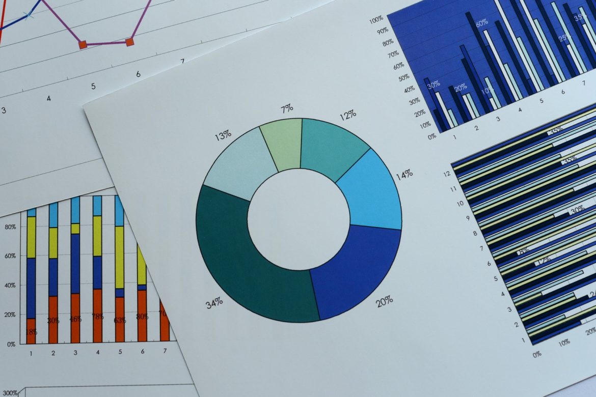
Data visualisation is the representation of information in a graph, chart or other visual format. By communicating the relationships between different data points it makes it easier for audiences to see trends more easily. Some examples of common visualisations include.
Change over time
The most common use of data visualisation is to represent changes in a situation over time, allowing audiences to identify how a situation is progressing.
Frequency
Charting the frequency of an event allows audiences to see quickly if something is happening more or less often.
Analysing relationships
Presenting links between variables is a powerful way to communicate potential relationships simply.
Producing data visualisations
- It is important for journalists producing data visualisations to be able to understand the data they are working with. Journalists developing data visualisations should have a good level of data literacy, including how to work with and interpret large data sets. A good introduction to all aspects of the subject can be found in The Data Journalism Handbook produced by the European Journalism Centre.
- Effective search is important and when searching for data, you can search terms relating to the content of the data you are looking for plus information on the format you might expect to find it in. In Google, for example, it is possible to search by file type – filetype:xls will only return Excel spreadsheets.
- Datajournalism.com points to a number of dedicated data portals, data hubs and other data sites that are broadly accessible. These include official government data portals, with a list of almost 600 is available at datacatalogs.org. Beyond searches, the advice is to ask your community or associated experts where to find the data that you need.
- There are a huge range of data visualisation formats available. When presenting data it’s important to consider the best format to help your audience understand the story you want to tell. Top tips include removing any data that doesn’t support the story and adding elements that highlight key points, trend lines or callouts for example.
Data literacy
Data journalism relies on analysis conducted by skilled journalists using specialist processes and tools, but it also requires a broader range of staff to be familiar with the basics of data analysis. “This isn’t just about data journalists,” explains the FT’s Burn-Murdoch. “I think it’s also about the need for all journalists to be a bit more data literate, because you’d struggle to cover something like COVID authoritatively if you’re not data literate.”
And, although technology lets journalists create data visualisations to support their reporting, consideration has to be given to how it is done. It is important that reporters are careful not to manipulate data to suit their own narratives, for example. And publishers must also be aware that not all audience members have the data literacy needed to interpret complex data visualisations.
This piece was originally published in Spiny Trends and is re-published with permission. Spiny Trends is a division of Spiny.ai, a content analytics and revenue generation platform for digital publishers. For weekly updates and analysis on the industry news you need as a media and publishing business, subscribe to Spiny’s Trends weekly email roundup here.