

|
Getting your Trinity Audio player ready...
|
Go deeper and smarter with your metrics and find precious information about your audience satisfaction
Metrics are fundamental to newsrooms’ day-to-day work, but they can be resource-intensive and challenging to implement or understand correctly. Page views sound like a manageable number to understand and base decisions on, but there is a lot of nuance to it. And nowadays, it isn’t a relevant metric for most outlets, especially subscription- and member-driven ones.
The era of ad-based income prioritised basic metrics like unique visitors and views, which led even legacy publishers to invest in SEO and social media algorithms cracking. However, such data can’t reveal what readers really like or dislike and lacks context to understand the numbers. Relying too much on this data might lead to harmful decisions, such as focusing on SEO to drive page views instead of, for instance, working on adding value for readers or engagement.
Today, these metrics are even less helpful with a growing number of subscription-driven and membership-based media organisations. To make sense of the numbers, publishers should focus on meaningful metrics, measuring the impact on the audience or its actions. Of course, most of them already look more at returning visitors and engaged minutes in the article. Still, analytics technologies give us plenty of opportunities to get more valuable and informative data.
We gathered a few metrics ideas for you to get inspired and experiment in your newsroom.
The idea for a subscription-driven newsroom: lifetime volume rate
For a subscription-driven outlet, revenue per subscriber is a crucial metric. However, it doesn’t tell us how much a subscriber enjoys the content produced by the newsroom. The lifetime volume rate is of help here.
To calculate this metric, you need to compare the number of your content units (articles, newsletters, podcasts, videos, etc.) to how many of them each subscriber has read. For example, if you have published 100 newsletters, and a subscriber has read 56 of them, the lifetime volume rate equals 56%. Is this much? It depends on your goals.
As media analyst Thomas Baekdal explains in his newsletter, this metric is more beneficial for a niche outlet that doesn’t publish a lot of content — for instance, one newsletter per week. In such a case, your ultimate goal would be closer to 100% volume per subscriber. “You want your subscribers to engage with as many of your articles as possible. If they don’t, you are producing too much, and your focus is lacking,” Baekdal writes.
However, for big publishers with several target audiences and dozens of content pieces per day, this metric wouldn’t tell much.
The idea for a newsletter: a simple survey
The Financial Times has more than 40 newsletters with different audience reach. Open rates were among the critical metrics to understand the newsletter’s health, but the changes Apple introduced with the Mail app Privacy Protection update affected the accuracy of numbers.
Looking for a more informative and practical metric to track the enjoyment of its newsletters, the FT ended up doing a survey. First, the team created a one-click feedback form as a simple satisfaction scale from 1 to 5 embedded into the bottom of the newsletter. Then, to motivate readers to respond and get more replies, the FT added a monthly prize draw to win £100 of book vouchers for those who finished the survey.
After clicking on a satisfaction scale, a separate tab opens where respondents have to fill out the whole survey consisting of two open-ended questions: “What is the reason for your score?” and “What could we do to improve?”. The team also developed questions to get feedback on specific ideas about audience interest in networking, events or engaging on social media.
In half a year, the FT received more than 78,000 replies to its feedback form. It helped understand which newsletters drive more engagement, but perhaps even more valuable were verbatim answers. The team shared a few insights from these replies in a piece for Inbox Collective, including, for instance, “promoting Premium content in Standard newsletters is extremely frustrating for readers who can’t access this exclusive content”. As a result, journalists made several changes to their newsletters, though the results are yet to be declared.
Additionally, 9% of respondents indicated they would be happy to answer further questions from the FT. And, as the team points out, they already used some of these participants for feedback on a newsletter redesign.
The idea for a member-driven outlet: change of an individual’s financial contribution over time
There are some obvious metrics to use in a member-driven newsroom: revenue earned from members, the number of new members acquired per month, the average monthly contribution of members, and others.
However, it can be valuable to analyse the upgrade rates of members or the percentage change of an individual’s financial contribution over time. In a survey done by the Membership Project in August 2020, only 21.05% of the outlets used this metric. It is a more individual and valuable metric, showing a change in a mood towards the outlet.
It is important to remember that changes in a contribution may be caused not only by (dis)satisfaction with the outlet’s content but also by external factors, such as a worsened financial situation. That’s why metrics should be used in combination, analysing demographics and geographical data and looking into more qualitative information if possible (directly talking to your readers is a wonderful, though resource-intensive, tool).
Bonus idea for inspiration: indices instead of raw numbers
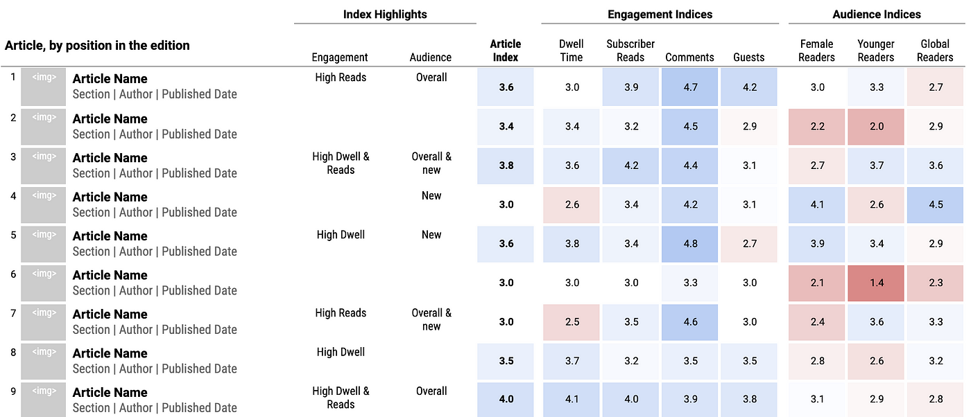
British outlet The Times found a way to add context and certainty into two basic metrics — article views and engaged time. In the article describing their experience, Daniel Gilbert, at the time Director of Data at News UK, explains that the problem was in how diverse the content and its distribution was, which made the metrics useless: longer articles have, on average, longer reading times, and the content on the top of the website homepage gets more views.
So, they came up with indices. Every article has an expected number of views and reading time based on its characteristics, which is counted through a machine learning model. Then the analytics software compares expected numbers with the real ones and gives an index on a scale from 1 to 5, where 3 is “just as expected”.
The system helps find stories in the outlet’s analytics more easily and effectively. To improve it, the team also added indices on the total number of people who start reading an article, how many comment on it, and how well the article performs for each of the target audiences of The Times. It all opened a door for a ton of data visualisation and experimenting and simplified the analytics for journalists, helping them understand how well their works perform.

However, be aware that every system is flawed. As Gilbert says, when the team checked their indices with journalists, several times they “have been confronted with the fact that an article with one of the lowest scores (and therefore deemed bad by the machine) is the one that got nominated for a journalism award”. Of course, no system is ideal, but in the search for it, you may find the right metrics for the aims and goals of your newsroom.

This piece was originally published in The Fix and is re-published with permission.

