
|
Getting your Trinity Audio player ready...
|
Flourish is a data visualization tool launched in early 2018 by Duncan Clark and Robin Houston. The pair started working on data visualizations in 2012 as a side project, but quickly saw success with projects such as the Carbon Map. They subsequently set up an award-winning visualization studio, Kiln, based in Farringdon, London to further expand their data visualization services as well as to launch Flourish onto the market.
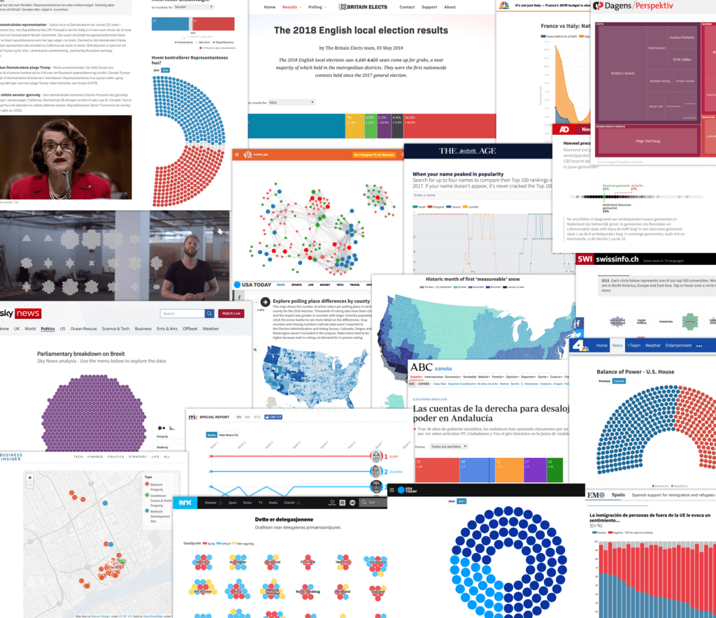
Flourish has since enjoyed considerable plaudits, working with Google, the Guardian, the FT, Business Insider, and the BBC. It is also important to note that, because of funding from Google News Lab, Flourish is free for all journalists and newsrooms. WNIP caught up with the team to find out more.
What business problem is your company addressing?
Interactive data
Flourish was created to change this and make visual and interactive storytelling accessible to all. In essence, it is a tool to allow non-coders to create high-end visualizations and stories without the cost and delays of commissioning bespoke projects.
What is your core solution?
Flourish allows any journalist to quickly create not only basic charts and maps, but also advanced interactives and animated projects that would take weeks or months to make even with a developer available. From data-driven quizzes, 3D globes and maps, photo sliders, animated “dot” visualisations, and network and Sankey diagrams.
Flourish also provides a ‘developer kit’: any developer can create new Flourish templates and upload them to the platform, with no limits on design or functionality. This makes Flourish ideal for bigger newsrooms with interactive desks, as it allows them to “templatize” their home-made graphics for easy reuse by non-coding journalists. This improves workflows, increases the quality and quantity of output, and saves time that could be better spent making one-off projects.
Can you give some examples of publishers successfully using Flourish?
Flourish has empowered journalists in smaller newsrooms all over the world, from the US and UK to Turkey, India
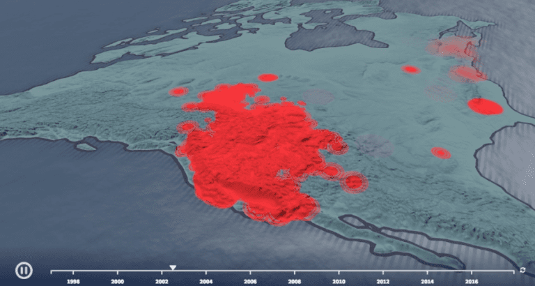
Below is an example of Flourish in action.
Pricing?
Flourish was created by a team of ex-journalists and is free for journalistic use, in partnership with Google News Lab. The free offering includes premium features such as private templates and private projects. Newsrooms can apply for this program at flourish.studio/newsrooms.
What are other people doing in the space and why?
There are a number of data visualisation tools that allow journalists and analysts to create basic charts and maps. It’s possible to make these basic charts and maps in Flourish, but we want take it a step further and allow people to create advanced visualisations that are interactive, that animate, and that would normally take a long time to make, even if you have developers in your team.
How you do view the future?
We are non-stop working on improving Flourish, adding new features and visualisation types. We notice that a big challenge for journalists at the moment is finding the right visualisation for their data. One of the things we want to do in the near future is help journalists make the right decisions.
Thank you.